The type we use helps to convey the personality of our brand.
For all print projects at the University of Lethbridge we approve the use of 2 distinct sans-serif font families; Bebas Neue and Open Sans. Where a serif font is required in combination with Bebas Neue or Open Sans use Bodoni.
Open Sans is the approved majority typeface for print use, to be used for most text based items in any print document. Open Sans is an open source font and can be used across all mediums interchangeably. Use is to be “grandfathered” in and completely replace Frutiger font family moving forward.
Bebas Neue is the approved typeface for “Display” use, to be used for things such as headings, and other bodies of text that need to be highlighted and use in a more artisic way. Bebas Neue is an open source font and can be used across all mediums interchangeably.
You can download the above fonts for use here:
Bebas Neue
Open Sans
Bodoni SvtyTwo ITC TT
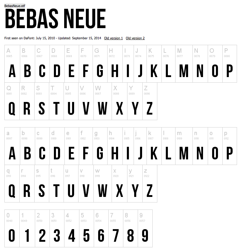
Bebas Neue:
Open Sans:
Bodoni:
History of Helvetica and Helvetica Neue
Helvetica is a widely used sans-serif typeface developed in 1957 by Swiss typeface designer Max Miedinger with input from Edouard Hoffmann. It is a neo-grotesque or realist design, one influenced by the famous 19th century typeface Akzidenz-Grotesk and other German and Swiss designs. One of the most popular typefaces of the 20th century, its use became a hallmark of the International Typographic Style that emerged from the work of Swiss designers in the 1950s and 60s.
Neue Helvetica (or Helvetica Neue) is a reworking of the Helvetica typeface with a more structurally unified set of heights and widths. Other changes include improved legibility, heavier punctuation marks, and increased spacing in the numbers.
Neue Helvetica uses a numerical design classification scheme, like Univers. The font family is made up of 51 fonts including 9 weights in 3 widths (8, 9, 8 in normal, condensed, extended widths respectively), and an outline font based on Helvetica 75 Bold Outline (no Textbook or rounded fonts are available).
The Neue Helvetica sets new standards in terms of its form and number of variants. It is the quintessential sans serif font, timeless and neutral, and can be used for all types of communication.
History of Bebas Neue
Bebas Neue is a sans serif font family based on the original Bebas Neue free font by Ryoichi Tsunekawa. It has grown in popularity and become something like the “Helvetica of the free fonts”.
Now the family has four new members – Thin, Light, Book, and Regular – added by Fontfabric Type Foundry.
The new weights stay true to the style and grace of Bebas with the familiar clean lines, elegant shapes, a blend of technical straightforwardness and simple warmth which make it uniformly proper for web, print, commerce and art.
Original Designed by Ryoichi Tsunekawa, Dharma Type Foundry.
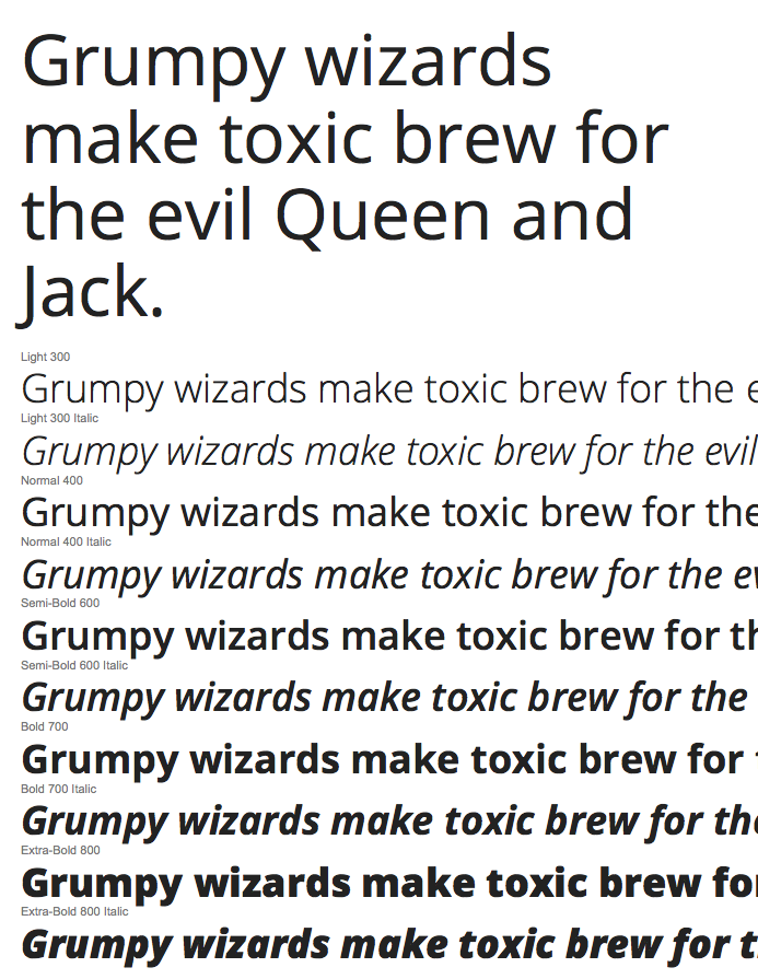
History of Open Sans
Open Sans is a sans-serif typeface designed by Steve Matteson and commissioned by Google. According to Google, it was developed with an “upright stress, open forms and a neutral, yet friendly appearance” and is “optimized for legibility across print, web, and mobile interfaces.”[3] Its design is almost identical to that of Droid Sans, with the exception of wider characters and the inclusion of italic variants. Whereas Droid Sans is used primarily in the user interfaces of some Android phones, Open Sans is used in some of Google’s web pages as well as its print and web advertisements.
Open Sans is available in a large number of variants for a font with an open license. There are 5 variants for weight (300 Light, 400 Normal, Semi-Bold 600, Bold 700 and Extra Bold 800) and each one has an italic version, totaling 10 variants. There is also a separate font called Open Sans Condensed with 3 width variations.[4]
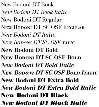
History of Bodoni
Bodoni is a series of serif typefaces first designed by Giambattista Bodoni (1740–1813) in 1798. The typeface is classified as Didone modern. Bodoni followed the ideas of John Baskerville, as found in the printing type Baskerville: increased stroke contrast and a more vertical, slightly condensed, upper case; but took them to a more extreme conclusion.
Bodoni had a long career and his designs evolved and varied, ending with a typeface of narrower underlying structure with flat, unbracketed serifs, extreme contrast between thick and thin strokes, and an overall geometric construction. Though these later designs are rightfully called “modern”, the earlier designs are “transitional”.
Some digital versions of Bodoni are said to be hard to read due to “dazzle” caused by the alternating thick and thin strokes, particularly as the thin strokes are very thin at small point sizes. This only occurs when display versions are used at text sizes, and it is also true of much display type that is used at text sizes. Non-dazzling versions of Bodoni that are intended to be used at text size are “Bodoni Old Face”, optimized for 9 points; ITC Bodoni 12 (for 12 points); and ITC Bodoni 6 (for 6 points).
Citations:
“Helvetica.” Wikipedia. Wikimedia Foundation, n.d. Web. 23 Dec. 2014.
“Helvetica® Neue.” – Webfont & Desktop Font « MyFonts. N.p., n.d. Web. 23 Dec. 2014.
“Bebas Neue | Fontfabric™.” Fontfabric RSS. N.p., n.d. Web. 23 Dec. 2014.
“Bodoni.” Wikipedia. Wikimedia Foundation, n.d. Web. 23 Dec. 2014.