How do Statistical Tests Work?
The examples on this page are designed to give the reader some intuition for how statistical tests work. They are not intended as a formal introduction to the mathematics of statistics.
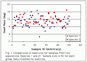
Take a look at the graph below which shows some (made up) data comparing seed size for two different species of plant. The Y axis shows the seed mass for 50 seeds from each species. The X axis is just an arbitrary number assigned to each seed to spread the data out across the graph (i.e. seed 1, seed 2, etc.).
From these samples, do you think the two species have different mean seed sizes? Try to estimate how much confidence you would have that they are different or the same (i.e. 30% confident, 40% confident, etc.)
Okay. Now keep your thoughts about the first graph in mind while you look at the second graph below. Carry out the same process of trying to decide whether the two populations have different mean seed size. Try not to peek at the text underneath the graph until you have made your decisions.
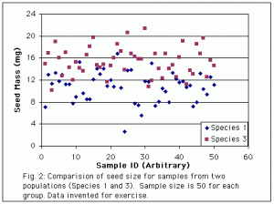
Hopefully you concluded that Species 1 and 3 have different means, and that you can be more confident of this than you can that Species 1 and 2 are different. The means are obviously further apart between Species 1 and 3, and that allows us to see the difference more clearly, and have more confidence the difference is not just a result of random variation in the sample of seeds we happened to pick.
Now take a look at the next graph. Once again try to decide if the means are different, and what it is about the data that helps you to reach your conclusion. Again, try not to peek at the explanation until you have made your own assessment.
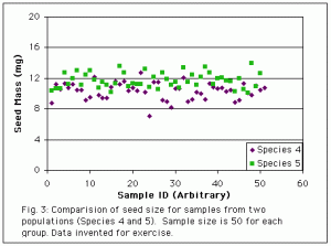
Hopefully you concluded that Species 5 has a larger mean than Species 4. But the means of these two species are actually identical to the means of Species 1 and 2 (from Fig. 1). So why can we be more confident that there really is a difference. The answer lies in the amount of variance within each population. Species 4 and 5 have less “scatter”. The points are all tightly clustered around the mean. That makes it easier to see what the mean is, and therefore to see that the means of the two species are different.
Analyze the graph below the same way to look for one more factor that affects our ability to see differences between means.
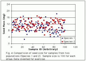
This is probably the trickiest factor to figure out. The species shown here are the same ones from Fig. 1. So why is it easier to see the difference in means from this graph? Here we have a larger sample from each population (100 vs. 50). The larger sample size again allows us to get a better estimate of where the means lie, and therefore to see that they are different.
So we have seen three factors that affect our intuitive ability to judge the difference between two means. A statistical test (the t-test) uses exactly the same factors, but in a rigorous, mathematical way, so that instead of saying (somewhat fuzzily) that we are more or less confident, we can put a number to our confidence, in the form of a probability that we will make an error if we decide the two means are different. (See also Types of Error.)
The box at right shows the formula for calculating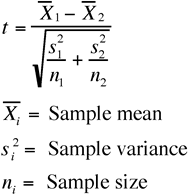 t, the test statistic generated by a t-test (for details look here). As t gets larger, the p-value (probability of mistakenly deciding two means are different) gets smaller. The difference between the two means is in the numerator, so as the difference gets larger, t will get larger. That means we have a smaller probability of making an error by concluding the means are different — we have more confidence they really are different. Increasing variance (s2) will make t smaller. As variance increases, we grow less confident the means are different. And increasing sample size makes t larger, increasing our confidence that the difference is real.
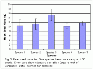
One final point. The graphs above do not summarize the data, they simply display all of the points. The graph below summarizes the data, in a way designed to illustrate the important trends being examined (differences in means). Notice how much easier it is to see the trends in the summary graph. In a paper you will always want to use graphs like the one below, which summarize the trends and make it easier for your reader to see them.